Industrial Identity for GA7NG
Conveyed the complex character of the clothing brand into digital
- Client
- GA7NG
- Location
- Saint Petersburg, Russia
- Year
- 2019
Бренд делают люди
What makes a product brand a true brand?
An outstanding style? Perhaps.
A unique idea? Yes, that's essential.
Working with GA7NG revealed another aspect of understanding — a brand is made by people.
THE STRENGTH OF A BRAND IS IN THE COMMUNITY
Что придумали
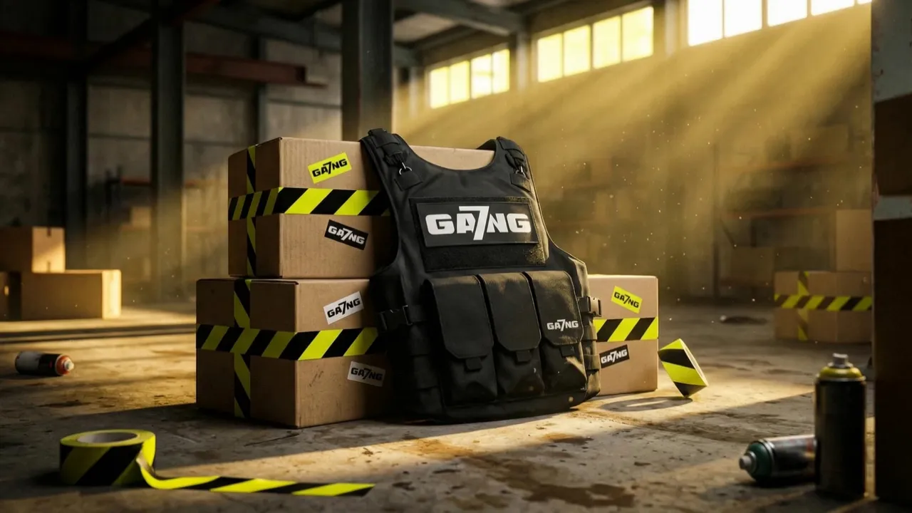
For a new brand from St. Petersburg, our team based the design on industrial navigation, stencil graffiti, and military markings.
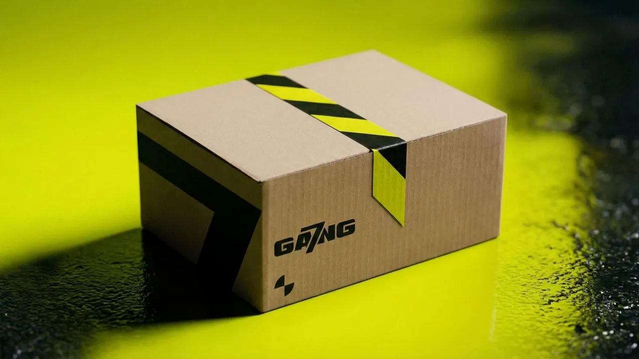
The contrast of neon and black, angular typography with an emphasis on the number '7', and deliberately noisy textures became part of a recognizable visual language.
This language, in turn, became the main communication tool with the target audience, forming a community of confident and ambitious individuals without glossy pretentiousness.
Every element — from embroidery to prints, stickers, tags, and packaging with a recognizable warning pattern — works for the brand.
AND SELLS IT AT FIRST GLANCE
Чем все закончилось
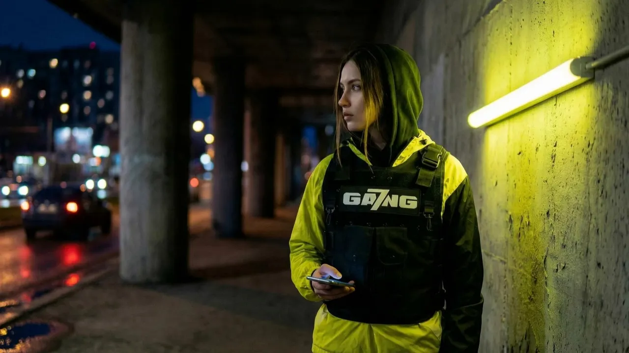
GA7NG was conceived as a response to the demands of a target audience with a military twist. This visual style looks great in the familiar atmosphere of a community techno party at an abandoned factory, hip-hop music videos, and illegal night races.
The audience's demands have changed over time. Now, ravers and musicians opt for more subdued looks, and the GA7NG brand focuses on tactical gear.
2019
год основания проекта и наш первый совместный кейс
5 лет
бренд GA7NG существует на WB
/ Project team
- Designer
- Sergey Gribanov
/ See also
Other projects
/ Liked this project?
We'll make something just as strong for your brand
Tell us about your task — we'll suggest an approach, timeline and estimate. First reply within a day, no obligations.
