WOWO: Visual system for the cutest brand
Developed an identity and branding that connected digital and product lines
- Location
- Moscow, Russia
- Year
- 2025
Links
Забота — да. Лапки и косточки — нет
WOWO came to us with a clear request: they needed a brand identity that would stand out among competitors and immediately convey that they care for every pet. We took on the challenge of creating an identity and packaging that are easily recognizable, inspire trust, and avoid clichéd images like 'paws' and 'bones'.
The concept is based on freshness, joy, and endless care. WOWO not only takes care of animals but also infuses the process with positivity. We moved away from templates, chose vibrant colors, lively form dynamics, and added a touch of humor in the details.
The logo is built on simplicity and friendliness: soft lines, open letters, emphasizing the warm connection between humans and pets. This visual language works equally effectively on packaging and digital platforms, making WOWO recognizable at first glance.
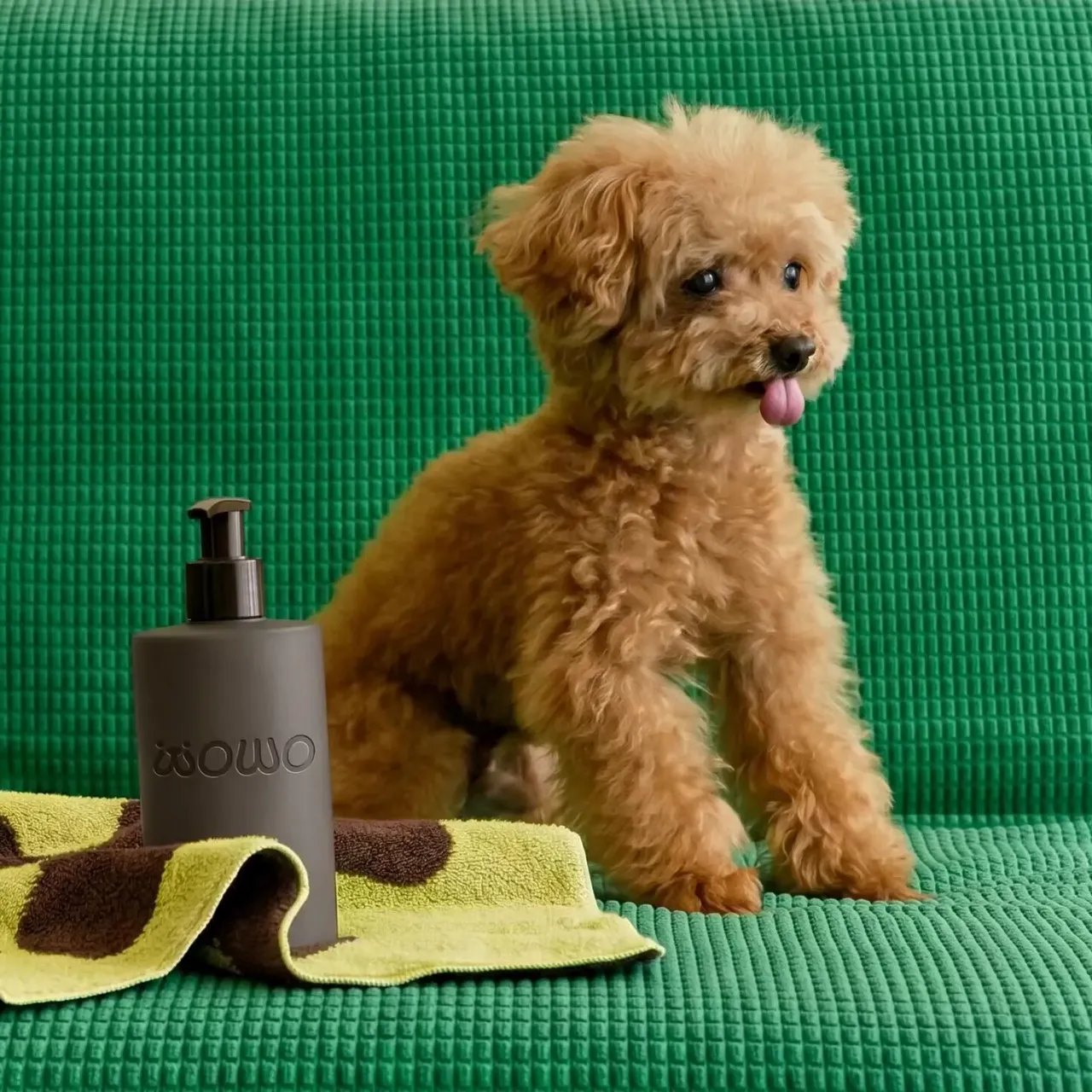
In this case, minimalism serves as a tool for the brand to have an honest dialogue with the client.
Every element supports the main idea: the pet and the person are partners. In every situation, whether it's a routine walk or a visit to the vet, partners exist only together, and WOWO's mission is to make this partnership as comfortable as possible.
Therefore, WOWO's visual language is built on simplicity. Concise forms and fresh color solutions immediately make the brand stand out on the shelf. A person might get lost among the abundance of brands, but their pet has already made the choice for them — and it's WOWO.
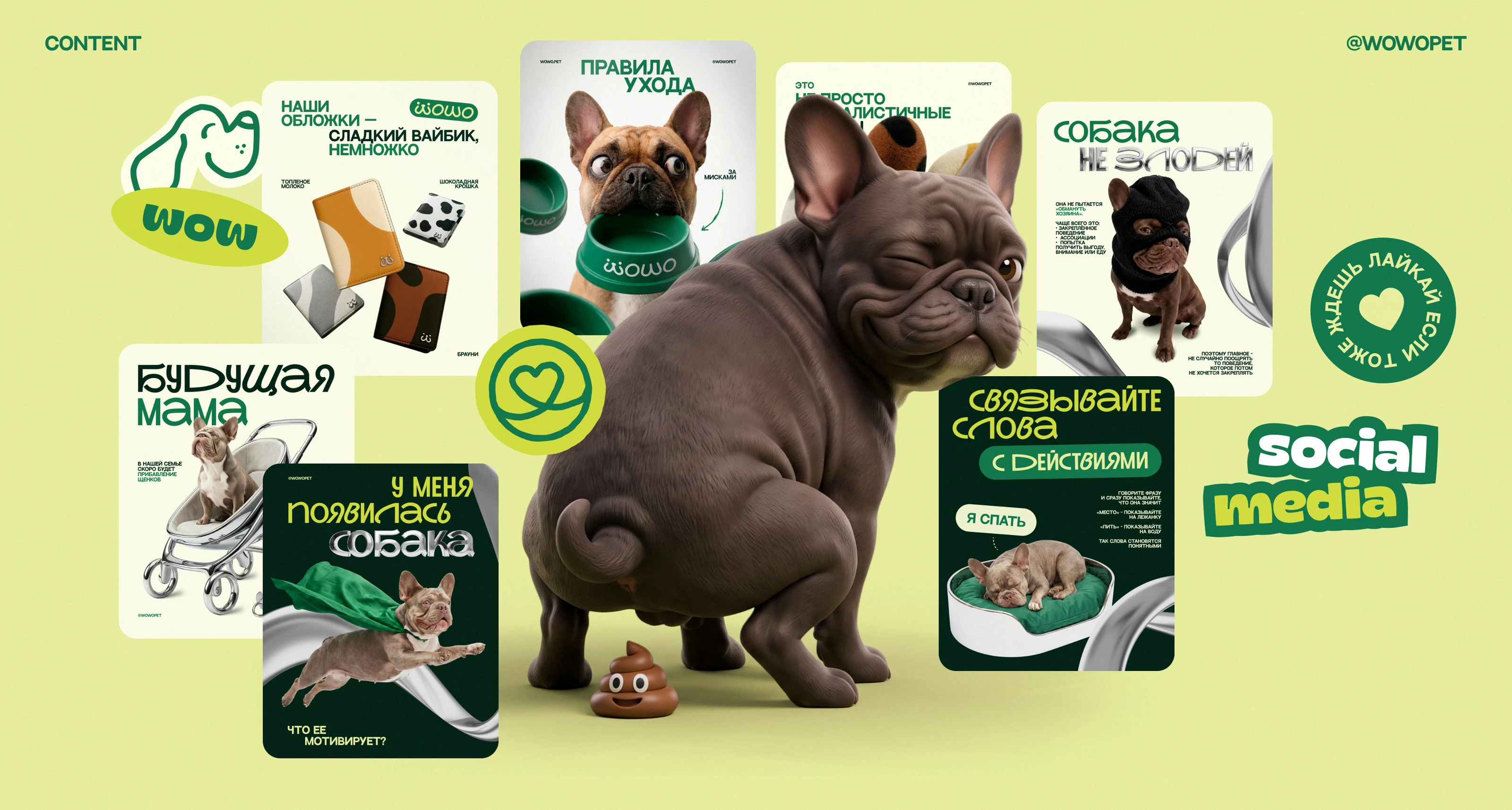
Bright visuals and a pinch of signature humor from the Gribzer team mark the videos and social media posts. Useful content can also be engaging.
Упаковка с характером
Each WOWO package is a continuation of the brand's concise visual language. For the product line, we created a series of patterns inspired by the distinctive features of popular breeds. Each pattern is easily recognizable and helps the product stand out on the shelf. It also conveys the idea of each pet's individuality, which is closely linked to the owner's character. After all, they say animals often resemble their owners (and vice versa).
At the core is pure modern graphics. We thought through the details down to the nuances: the packaging lines mimic recognizable animal silhouettes, and the patterns are seamlessly integrated into the design structure.
As a result, WOWO products look fresh and relevant, and the signature patterns unify the range and add that joy the brand conveys at every level of interaction.
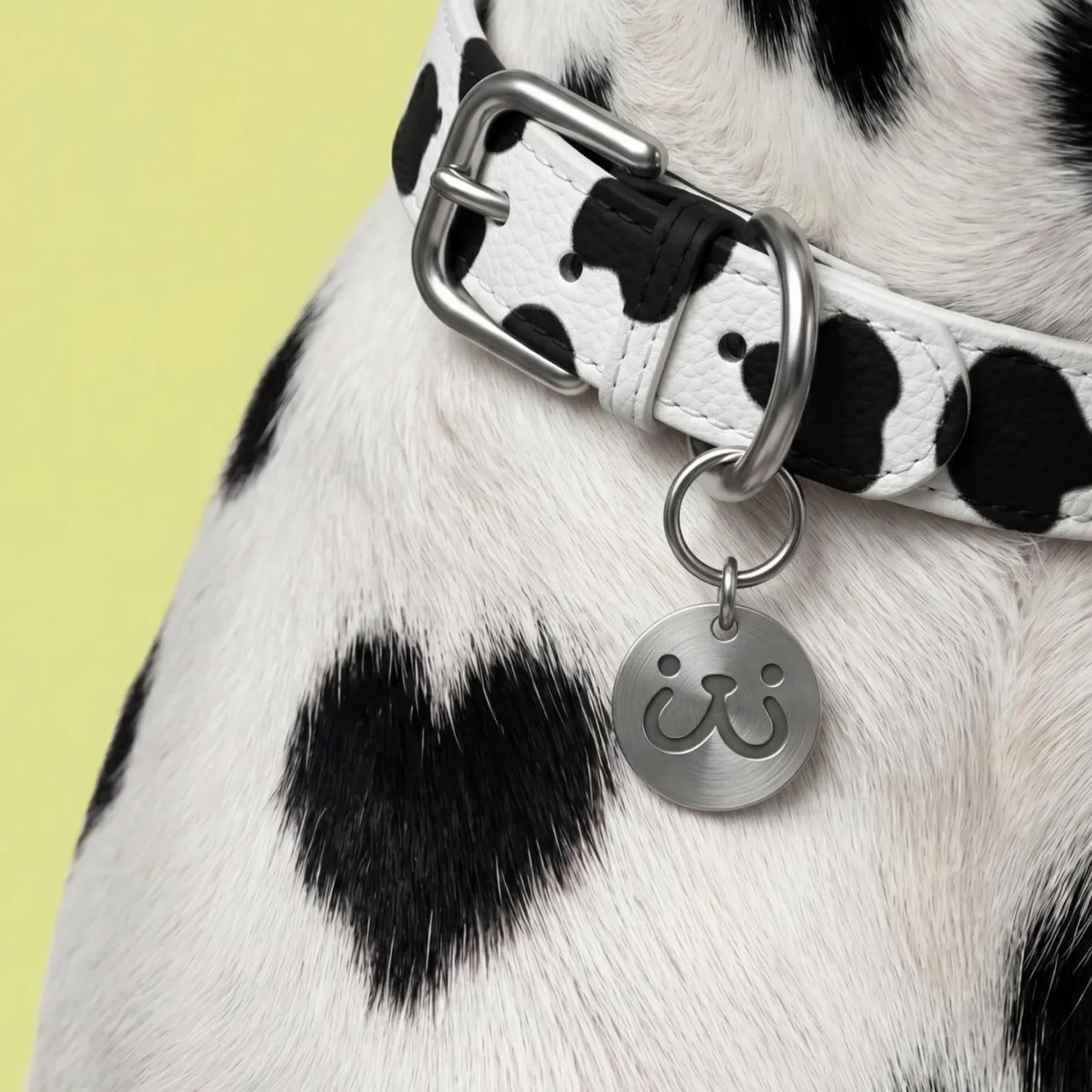
/ Project team
- Art Director
- Sergey Gribanov
- Designer
- Artem Kachanko
- Motion Designer
- Vadim Shalnov
- Motion Designer
- Rodion Mityukov
- SMM Specialist
- Elizaveta Kuteminskaya
/ See also
Other projects
/ Liked this project?
We'll make something just as strong for your brand
Tell us about your task — we'll suggest an approach, timeline and estimate. First reply within a day, no obligations.
