The DNA Group: visual system and social media
Created a contrasting brand style for a new project from a trusted client
- Location
- Dubai, UAE
- Year
- 2024
Link
Когда руки развязаны
Our team is often recommended for new projects and given extensive creative freedom. This approach allows us to excel in branding development, hitting the mark 99.9% of the time.
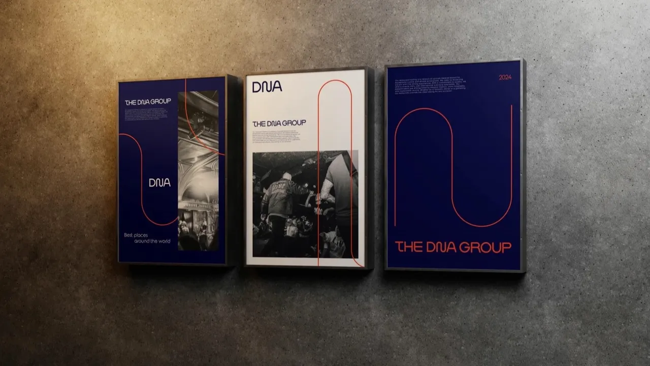
For our partners at The DNA Group, we crafted a visual system worthy of the international premium segment in HoReCa.
PENN BLUE
Благородный Penn Blue часто встречается в логотипах крупных компаний. Например, это официальный цвет Университета Пенсильвании.
WHITE
Классический белый в описании не нуждается. Универсальный цвет, в нашей палитре выполняет акцентную функцию.
SCARLET
Английский перевод лишь отчасти сохраняет очарование названия этого цвета на русском. А как вам Алый цвет?
Что сделали
A concise brand style formed the basis of the visual system. We expanded on the ideas laid out during the logo development, using a minimalist palette and recognizable graphics to ensure the identity easily scales and adapts to both digital and print formats.
Special attention was given to the graphic design of social media. We created a series of templates for posts and stories: they maintain a consistent style, making the feed recognizable and visually cohesive.
/ Project team
- Art Director
- Sergey Gribanov
- Designer
- Artem Kachanko
- Motion Designer
- Vadim Shalnov
/ See also
Other projects
/ Liked this project?
We'll make something just as strong for your brand
Tell us about your task — we'll suggest an approach, timeline and estimate. First reply within a day, no obligations.
