Мы больше по велосипедам, но тут не устояли
Our team is more into cycling, but we couldn't pass by Outfight. The founders' energy is infectious — when talking to them, you feel like dropping everything and heading to the nearest sports store for gear. Or at least planning a group watch of a tournament with friends.
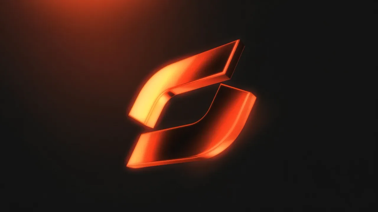
We captured this energy in the brand identity
Характер бренда
Bold, but not aggressive. Energetic and purposeful. Dynamic, powerful, strong.
This is the character of the brand — and our identity.
Contrasting colors, bold typography, and rhythmic compositions instantly catch the eye and enhance brand recognition in any format.
Each template easily adapts to maintain the brand's style in live covers, feed posts,
Чем все закончилось
The new visual system for Outfight quickly became recognizable: tournament grids, posters, and broadcast graphics now speak the same language.
The entire system is compiled in a detailed guidebook: instructions, examples, typography, and color recommendations.
Thanks to this, the project team can quickly create content without risking the loss of the brand's signature style.
/ Project team
- Art Director / Designer
- Sergey Gribanov
- Designer
- Artyom Kachanko
/ See also
Other projects
/ Liked this project?
We'll make something just as strong for your brand
Tell us about your task — we'll suggest an approach, timeline and estimate. First reply within a day, no obligations.
